TL;DR
Listicles are list-format pages (“5 reasons,” “7 mistakes”) where every item builds the case for one product. As a landing page, the listicle converts cold paid traffic better than a product page because it reads as content and earns the purchase decision item by item. The winning move is one listicle per ad angle, not one per brand.
A listicle landing page is the most under-used page format in DTC paid media. Cold traffic won’t buy off a product page, and a hard-sell lander asks for the decision before the shopper knows why they’d want the product. The listicle sits between the two: it looks like an article, reads like an argument, and closes like a landing page.
You’ll get the definition first, because the term gets searched by writers and students as well as media buyers. Then the part that matters: when a listicle beats every other format, how to structure one, five worked examples, and why you should be running a different listicle behind each ad angle.
Key Takeaways
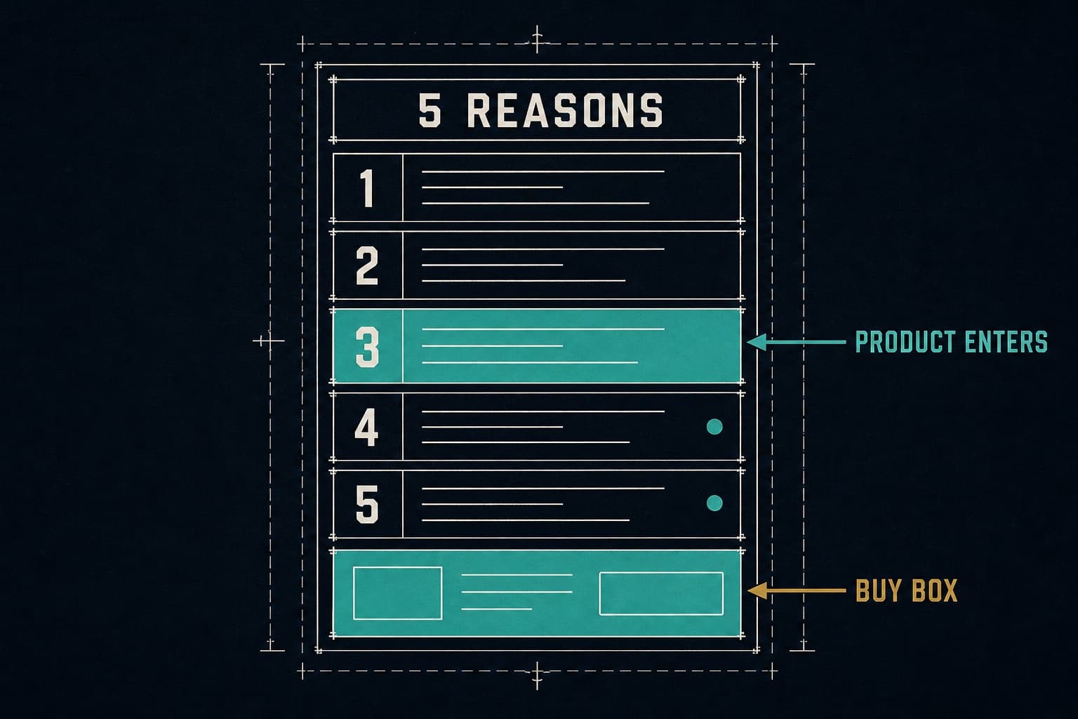
- A listicle is a numbered list where each item is a self-contained argument. On a landing page, every item supports one product and the product enters at item two or three, not the headline.
- Traffic temperature picks the format. Listicles win on cold, problem-aware traffic. They lose to direct-offer pages on retargeting and branded search.
- A dedicated pre-sell page converts cold traffic 2 to 3x better than a product page, according to SplitBase.
- The number in the headline is a testable variable. “5 reasons,” “7 mistakes,” and “3 things” pull different audiences and different scroll depths.
- One listicle per ad angle. A “5 mistakes” ad and a “best for sensitive skin” ad need different lists, or one of them is paying for a mismatch.
What is a listicle?
A listicle is an article structured as a numbered list, where each item is a short, self-contained point and the headline promises the count: “7 Ways to Sleep Better,” “5 Signs You Need New Running Shoes.” The format dates to print magazines and became the default shape of web content because it’s scannable, the payoff is stated up front, and readers know how long it will take.
That’s the listicle definition most people search for. The listicle landing page is a specific use of it: a list-format page, fed by paid ads, where every item builds the case for one product and the page ends in an offer.
Listicle vs advertorial vs product page
Three pages, three jobs.
| Page | Reads as | Traffic temperature | Where the product enters |
|---|---|---|---|
| Product page | A store | Warm to hot | Immediately |
| Advertorial | A story or article | Cold | After the mechanism is explained |
| Listicle | A numbered list | Cold to lukewarm | Item two or three |
The listicle is technically a subtype of the advertorial. Both are pre-sell pages that read as content. The difference is structure: the advertorial makes one long argument, the listicle makes five short ones. Readers who won’t sit through a 1,500-word story will scroll a numbered list, which is why the listicle often wins on colder, lower-attention traffic. Landra’s comparison covers the trade-off in more depth.
Why the format reads as content, not as an ad
A shopper who clicks a Meta ad expects to be sold to. A numbered list with a specific promise (“5 mistakes”) reads as something they’d find in a magazine, so the defensive posture drops. Each item is small enough to read without commitment, and by the time the product appears in item three, the reader has already agreed with two of the page’s points. That’s the mechanism: agreement before the pitch.
When a listicle beats every other page format
The listicle is not the best page for every campaign. It’s the best page for a specific slice of traffic.
Traffic temperature decides the format
Cold traffic doesn’t know your brand, hasn’t felt the problem sharply, and clicked out of curiosity. Warm traffic knows the brand, has visited, and is deciding. Hot traffic is coming back to buy. Every page format maps to one of those:
- Cold: advertorial, listicle, quiz
- Warm: direct-offer landing page, explainer
- Hot: product page, offer page, cart link
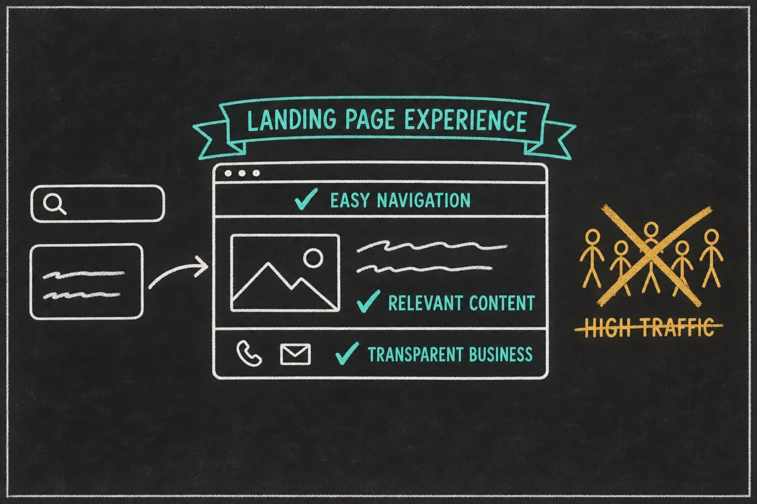
Running a listicle on hot traffic wastes the shopper’s time. Running a product page on cold traffic wastes your ad spend. SplitBase puts the gap at 2 to 3x: a dedicated pre-sell page converts cold traffic that much better than a product page. Our own reasoning on why is in landing page vs product page for paid ads.
Cold traffic and considered purchases
The listicle does its best work when the product needs some explanation but not a full education. Supplements with a clear mechanism, skincare with a specific claim, home goods that solve a named problem. The list gives you five slots to build the case without the reader feeling lectured.
Consider a hypothetical: a media buyer named Marcus runs paid for a sleep supplement doing $200K a month. Prospecting traffic went to the product page; cost per purchase had crept to $58. He built a “6 Reasons You Wake Up at 3 a.m.” listicle, product entering at item four, offer at the bottom with a subscribe-and-save toggle.
Same creative, duplicated with the new destination URL. Cost per purchase on the prospecting campaigns dropped to $41 in three weeks. Retargeting, which he left on the product page, didn’t move. That’s the pattern: the listicle helped the audience that needed convincing and did nothing for the audience that didn’t.
When not to use a listicle
Three cases where the listicle loses:
- Retargeting. The shopper has been to the site. Send them to the offer.
- Branded search. They typed your name. A product page or offer page closes faster.
- Impulse-price products. Under roughly $25, the decision is too small to justify five reasons. A direct-offer page with the deal above the fold wins.
Don’t oversell the format. A listicle behind a retargeting ad is a slower path to the same cart.
How to structure a listicle landing page
Six components, in order.
The hook and the promise in the headline
The headline states the number and the payoff, and it continues the ad’s hook. If the ad said “5 mistakes,” the page says “5 mistakes.” Not “The complete guide to” and not a brand tagline. The shopper clicked a specific promise and the first thing they see has to keep it.
Choosing the number, and why it’s testable
The number is a variable, not a convention. Three items is fast and works for a single strong claim. Five is the default because it’s long enough to build a case and short enough to finish. Seven signals depth and suits problem-aware readers who want thoroughness. Whether odd or even numbers pull better for your audience is a test, not a rule.
Test the number the way you’d test a hook. “5 Reasons” against “7 Reasons” with the first five items identical is a clean test of whether your audience wants more argument or less.
Each list item as a mini-argument
Every item follows the same shape: a bolded claim, one to three sentences of mechanism, and a visual. The claim states the point. The mechanism explains why it’s true. The visual makes it concrete. Items that are only a claim read as filler; items that run to 300 words break the scannability that makes the format work.
Where the product enters (item two or three, not item one)
The first item, or the first two, should be product-neutral. They establish the problem or the criteria. The product enters when the reader has already agreed with the page’s framing. On a “5 signs you need better insoles” page, items one and two describe symptoms. Item three introduces the insole as the fix. Items four and five keep building the case with the product now named.
The handoff to the buy box
The list ends. The offer has to be right there, not two scrolls down behind a brand story. The handoff is a single transitional block: a summary line (“If three of those five sounded familiar...”), a proof element, and the buy box. The listicle sells the idea; the buy box has to close it.
The close and the offer
The buy box on a listicle page needs the same things as any DTC buy box: unit options, per-unit pricing, the discount in dollars, the guarantee, and shipping terms. If the ad promised an offer, it’s visible here without a click. A sticky CTA that follows the reader down the page is fine; a buy box that only appears at checkout is a leak.
Want to see live listicle pages that are getting ad spend right now? They’re indexed in landing page examples that convert paid traffic, alongside the other four formats.
Listicle landing page examples
Five worked examples. Each one is described as ad angle, page response, and what it does with the number and the proof.
1. “3 Reasons Why People Are Ditching Booze This Year” (Aplós, non-alcoholic spirit). Ad angle: curiosity about drinking less. Page: three reasons, each a full argument with ingredients, benefits, and a testimonial, with a buy CTA after each item. The number is three because each reason is substantial. Proof sits inside each item rather than at the end.
2. “5 Signs Your Gut Is Off” (supplement category pattern). Ad angle: symptom recognition. Page: five symptoms the reader may have, each mapped to a mechanism. Product enters at item three. Proof is a review per symptom, placed under the matching item. This is a recurring structure across long-running supplement pages rather than one brand’s page.
3. “7 Mistakes Everyone Makes With Cast Iron” (cookware pattern). Ad angle: expertise and a slightly guilty reader. Page: seven mistakes, the product’s design addressing four of them. Seven because the audience wants thoroughness. Proof is a comparison table at the handoff rather than testimonials.
4. “5 Things I Wish I Knew Before Buying a Standing Desk” (home office pattern). Ad angle: first-person regret. Page: five lessons, written in first person, product entering at item two as “the one I ended up with.” Proof is the author’s own before-and-after setup photos, plus one expert quote.
5. “4 Reasons Runners Are Switching Insoles” (Fulton-adjacent). Ad angle: category switch. Page: four reasons tied to arch support, cushioning, materials, and fit. Product enters at item two. Fulton’s own published result, a 110% increase in paid conversion rate after 50+ page iterations, is evidence that this category rewards volume of page testing. Read how Fulton increased paid conversion rate by 110%.
What each one does with the number choice
Three for a small number of heavy arguments. Five as the default. Seven for a thoroughness-seeking audience. Four when the product has exactly four differentiators and padding to five would show.
What each one does with proof placement
The strong pattern across all five: proof inside the item it supports, not in a block at the end. A review about durability belongs under the durability item. The one exception is the comparison table, which works as a single proof block at the handoff because it summarizes every item at once.
One listicle per ad angle
This is the section no competing guide has, and it’s the whole point.
Most brands write one listicle per campaign. The creative team ships eight ads with four different hooks, and all eight point at the same “5 reasons” page. The page matches the “5 reasons” ad. It half-matches the “best for sensitive skin” ad. It doesn’t match the “founder story” ad or the “why I switched” ad at all, and those two are paying full price for a mismatched click.
The fix is a listicle per angle. The “5 mistakes” ad gets a “5 mistakes” page. The “sensitive skin” ad gets a “4 reasons sensitive skin needs a different routine” page. The founder story ad probably shouldn’t go to a listicle at all; it wants an advertorial. Each page continues its ad’s argument, and the shopper never has to re-orient.
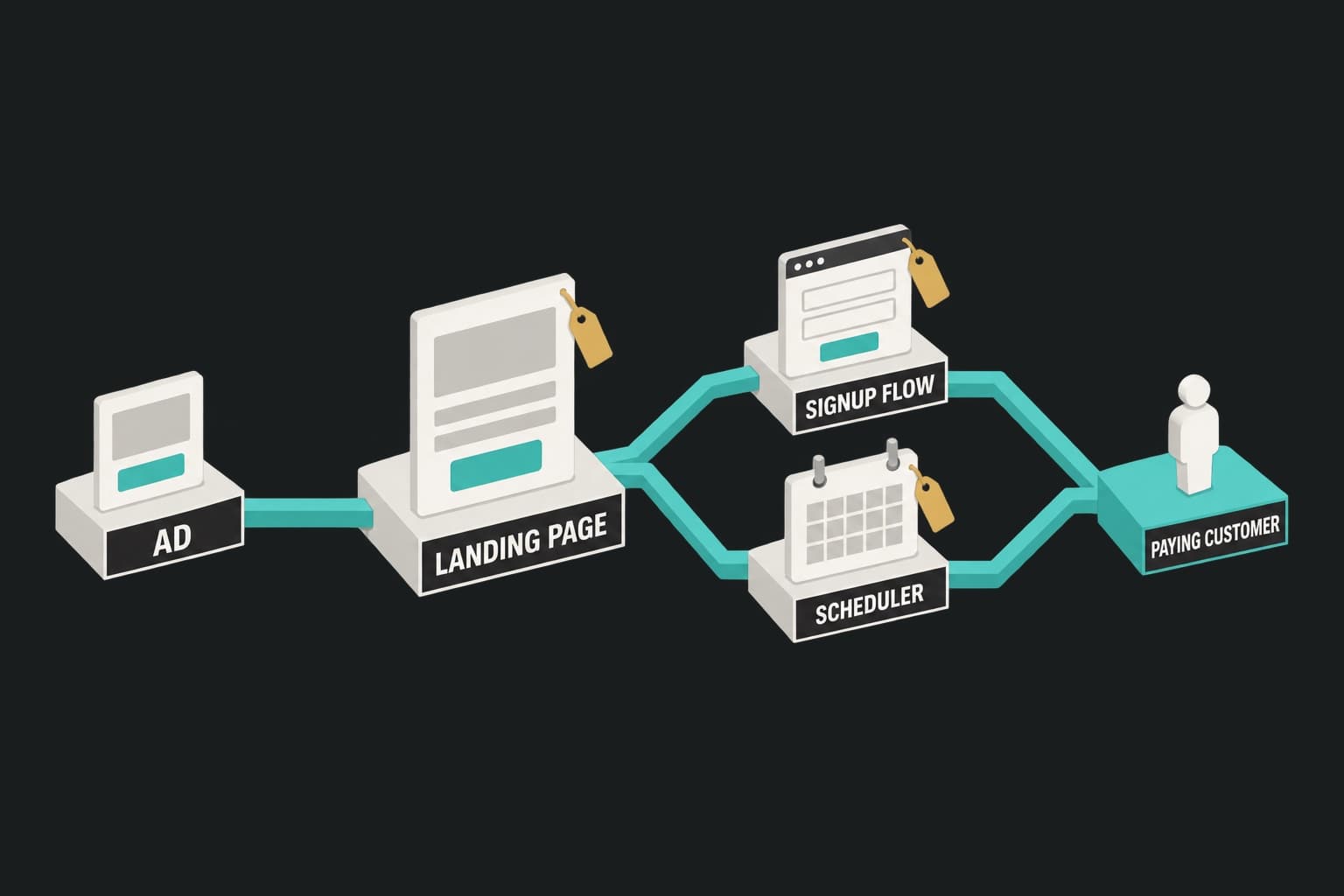
That’s what ad-matched landing pages means in practice: point Pagedeck at the ad, and it picks up the hook, the offer, and the creative, then builds the page that continues that pitch. Same list structure, different list, in minutes rather than a week per page.
How many variants is enough
One per distinct angle, not one per ad. If six ads share a hook, they share a page. If your account is running four angles, you need four pages. Past five or six live variants, spend per page gets thin enough that no test reads, so consolidate angles before adding another. Keep a direct-offer page for retargeting alongside them.
What to hold constant so the test reads clean
When you test listicle variants against each other, hold the buy box, the offer, and the proof elements constant. Vary only the list: the number, the item order, the item the product enters on. Otherwise a winning variant tells you something changed without telling you what.
Policy and compliance
Listicle pages get flagged. Not often, but often enough that you should know why before it happens to you.
Meta’s rules on advertorial-style pages
Meta’s Advertising Standards cover the landing page as well as the ad. Pages that mimic a news outlet’s layout, use a fake publication masthead, present a paid page as independent editorial, or fail to deliver what the ad promised are the usual triggers. A listicle is fine. A listicle dressed up as a health magazine’s article is not.
Keep the brand’s name and logo visible. Don’t imitate a publisher. Don’t use fabricated bylines or fake “as seen on” logos. If the page is yours, say so.
Disclosure, claims, and the before/after trap
Two claim types carry real risk. Health and outcome claims (“cures,” “clinically proven” without the study, “lose X pounds”) draw both Meta enforcement and regulator attention. Before-and-after imagery, especially for weight, skin, and body products, is restricted in ads and scrutinized on pages. If a list item makes a claim you can’t substantiate, cut the item.
The advertorial guide covers the full compliance picture, including FTC disclosure rules, in advertorial landing pages. The short version for listicles: read as content, but never pretend not to be an ad.
Measuring a listicle page
Two signals tell you whether a listicle is working, beyond the page’s conversion rate.
Scroll depth and the drop-off item
Scroll-depth tracking on a listicle tells you which item loses readers. If 70% of visitors reach item three and 30% reach item four, item three is the problem, or item four’s headline is. That’s a much more specific read than a bounce rate, and it points at a rewrite of one item rather than the whole page.
Testing the list order server-side
Item order is the highest-impact test on a listicle after the number. Move the product entry from item three to item two and see what the scroll data and the conversion rate do. Run the test server-side so the page doesn’t flicker between variants on paid traffic; client-side testing scripts swap content after the first paint, so the shopper either watches the headline change or waits on a blank page while an anti-flicker snippet hides the swap. Both cost trust, and the second costs load time. Server-side A/B testing is built into every Pagedeck page for exactly this reason, with unmetered traffic.
Frequently asked questions
What does listicle mean? A listicle is an article structured as a numbered list, where each item is a self-contained point and the headline promises the count. The word blends “list” and “article.”
How do you make a listicle for a landing page? Pick the number, write a headline that continues the ad’s hook, keep the first one or two items product-neutral, introduce the product at item two or three, give every item a claim, a mechanism, and a visual, and end with a handoff into a buy box that shows the offer.
Do listicle landing pages work for Facebook ads? Yes, for cold prospecting traffic on considered purchases. They underperform direct-offer pages on retargeting and branded search, so match the format to the traffic.
What’s the difference between a listicle and an advertorial? Both are pre-sell pages that read as content. An advertorial makes one long argument as a story; a listicle makes several short ones as a numbered list. The listicle usually wins on lower-attention cold traffic.
Conclusion
Listicles convert cold traffic because they earn agreement one item at a time before the product appears. Structure them with the ad’s hook in the headline, the product entering at item two or three, proof inside the item it supports, and a buy box at the handoff. Test the number and the item order server-side, and watch scroll depth to find the item that’s leaking.
Then stop writing one listicle per brand. Write one per ad angle, so every ad lands on a page that continues its own argument.
Build your first page free, no credit card needed. Point Pagedeck at the ad and it builds the listicle that matches.