TL;DR
The best landing page examples for paid traffic share five traits: one goal with no navigation, message match with the ad that drove the click, the offer visible above the fold, proof placed where doubt appears, and a buy box that does the math. This guide breaks down 17 DTC landing pages across five formats, judged on ad-to-page continuity and offer mechanics rather than visual polish.
Most landing page example roundups are lists of B2B SaaS pages judged on how they look. That is the wrong reference set if you sell a physical product to cold Meta traffic. A demo-request page for project management software and a pre-sell page for a $60 supplement have different jobs, different traffic temperatures, and different failure modes.
The pages below were chosen on two criteria: whether the page continues the pitch of the ad that feeds it, and whether the offer mechanics on the page do the selling. Those two things move conversion rate on paid traffic. Color palettes don’t.
You’ll get the selection criteria first, then the five traits every high-converting page shares, then 17 examples across five formats with the ad angle, the page response, and what to take from each.
Key Takeaways
- Judge a landing page on ad-to-page continuity and offer mechanics, not aesthetics. A page seen without its ad is being judged on half the information.
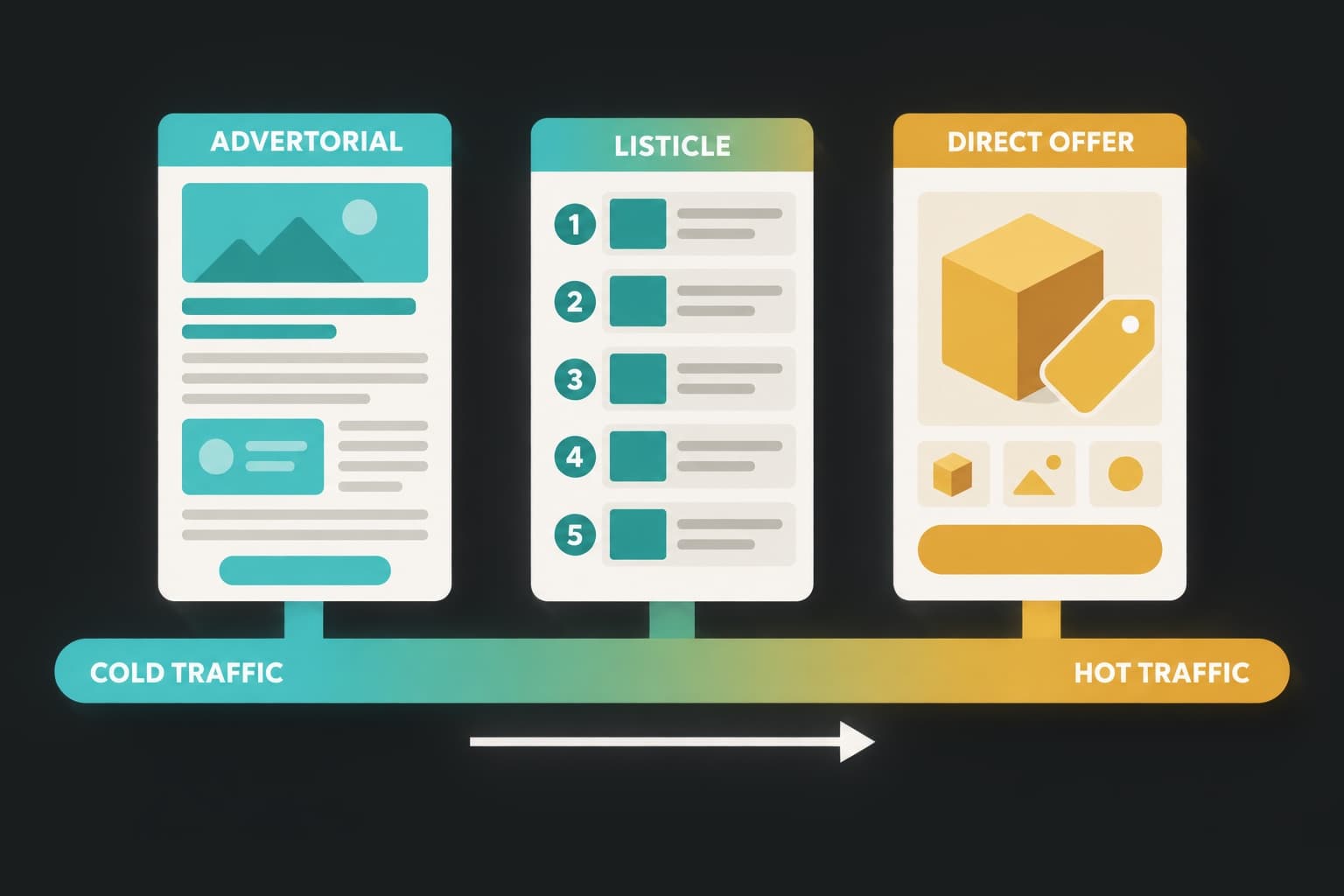
- Five formats cover nearly every DTC paid campaign: direct-offer, advertorial pre-sell, listicle, quiz, and bundle. Traffic temperature picks the format.
- The most common failure on scaled accounts is one page serving twelve ads. Fulton put 100% of paid traffic on dedicated pages, iterated 50+ times, and lifted paid conversion rate by 110%.
- A dedicated pre-sell page converts cold traffic 2 to 3x better than a product page, according to SplitBase.
- Sustained ad spend is the only free signal that a page works. A page that has been running for months behind the same ad is being paid for by results.
How we picked these landing page examples
Every example list needs a selection rule, and most don’t state one. Ours is simple: a page qualifies if it has been fed by paid traffic for long enough that the brand is clearly paying for results, and if the page visibly continues the pitch of the ad behind it.
Sustained ad spend as a signal
You cannot see a competitor’s conversion rate. You can see how long they’ve been running an ad, and where that ad sends people. A brand that keeps the same ad and the same page live for months is telling you the pair works. A page behind an ad that dies in three days tells you much less, since most ads get killed in creative testing regardless of the page.
That is the logic behind the world’s largest landing page library: 1M+ live landing pages, indexed by the ads pointing at them, so you can filter for the pages that are actually getting spend. The examples below are formats that show up repeatedly among long-running pages in that library. Where a brand’s page structure has been documented publicly, we cite that source rather than describing a page from memory.
What we looked at on each page
Four things, in order:
- Ad match. Does the headline pick up where the ad’s hook left off?
- Offer structure. What is the shopper buying, at what price, with what incentive?
- Buy box. Does the purchase module show the math, the options, and the guarantee without a click?
- Proof placement. Is social proof positioned at the point of doubt, or dumped in a testimonial block at the bottom?
No conversion rate is attached to a named brand unless that brand has published it. Two have: Fulton and Gravel. They get full breakdowns at the end.
What the best landing page examples have in common
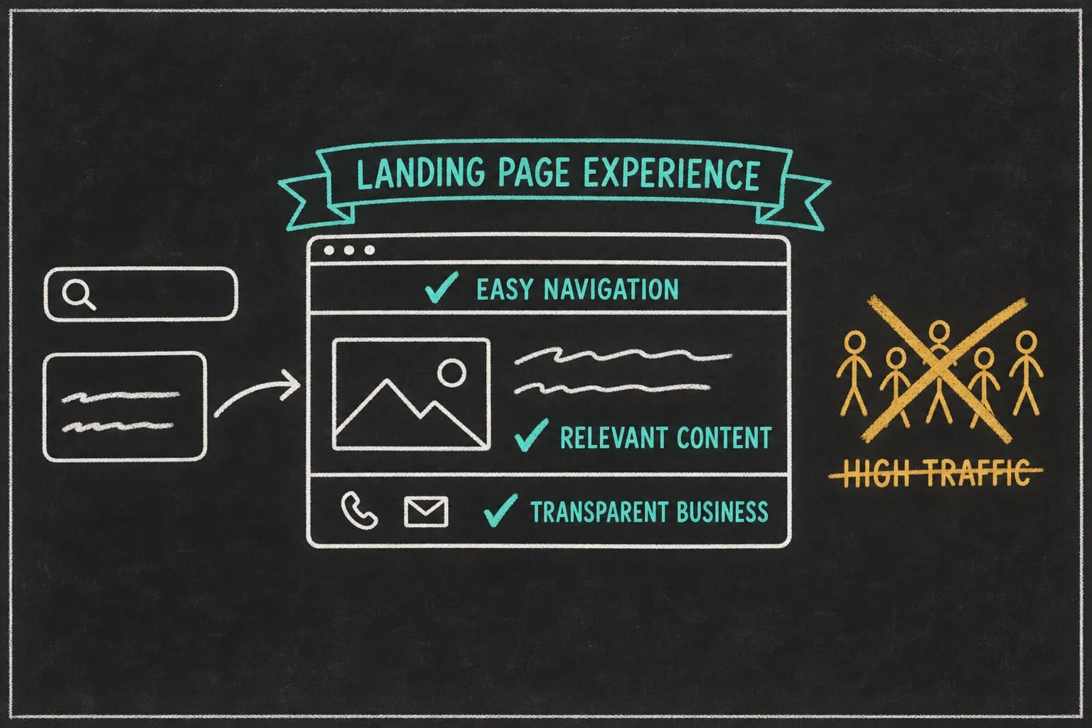
Before the examples, the five traits. Each one of the 17 pages below does most of these. The best do all five. For why each element converts, see what makes a high-converting landing page.
One goal, no navigation
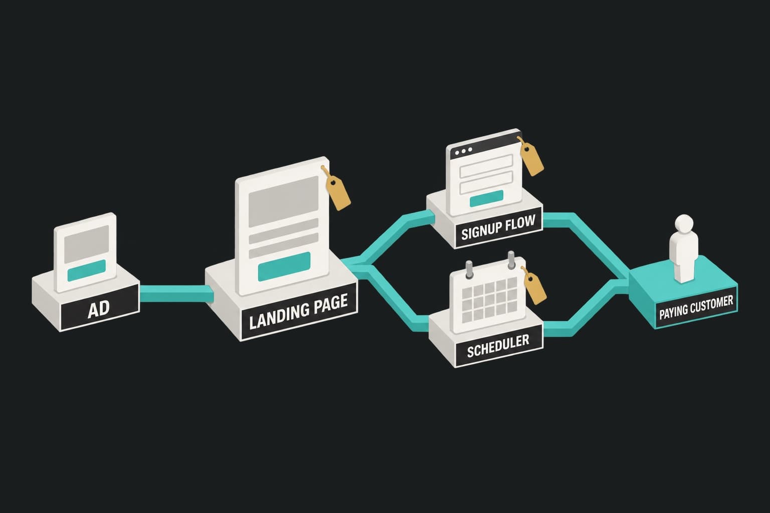
A landing page has one job. Remove the header nav, the footer link farm, and every path that isn’t the buy button. A product page has to serve browsers, search visitors, and returning customers. A landing page serves one ad’s audience. That is the whole argument in landing page vs product page for paid ads.
Message match with the ad that drove the click
The ad made a promise. The page has to keep it in the first headline, using the same words. If the ad said “three free soaps,” the page opens on three free soaps. If the ad ran a “5 mistakes” hook, the page is those five mistakes. A shopper who clicks a specific promise and lands on a generic page has to re-orient, and re-orienting is where cold traffic leaves.
The offer is visible above the fold
Price, incentive, and what’s in the box, all before the first scroll. Burying the offer below a brand story means the shopper decides whether to keep reading before they know what’s on the table.
Proof placed at the point of doubt
Testimonials work when they answer the objection the reader has at that moment. A review about durability belongs next to the durability claim. A “took two days to arrive” review belongs next to the shipping promise. A block of 40 reviews at the bottom is proof nobody reads.
A buy box that does the math for the shopper
The buy box is where DTC pages win or lose. It should show unit options, per-unit price at each tier, the savings in dollars, the guarantee, and the shipping terms. If the shopper has to open a calculator to work out whether the three-pack is a better deal, the page has failed.
Want to see what these five traits look like on pages that are getting spend right now? Search 1M+ live landing pages by niche, offer, or tactic. Research only is $49/month.
Landing page examples by format
Five formats cover most DTC paid campaigns. Traffic temperature picks the format: cold traffic needs a page that earns the decision, warm traffic needs a page that closes it.
| Format | Traffic temperature | Best for |
|---|---|---|
| Direct-offer / hero page | Warm, retargeting, branded search | Products the shopper already understands |
| Advertorial pre-sell | Cold | Considered purchases that need explanation |
| Listicle | Cold to lukewarm | Category education, problem-aware audiences |
| Quiz / finder | Cold to warm | Wide catalogs, personalization-led products |
| Bundle / offer page | Warm, AOV-led campaigns | Multi-unit offers, subscription starts |
The direct-offer page (warm and retargeting traffic)
The direct-offer page leads with the product, the price, and the incentive. No story, no education. It assumes the shopper already knows why they want the thing.
1. Nood (hair removal device). The ad angle is time to value: permanent results in eight weeks. The page headline carries that exact promise from the top, and the page repeats the eight-week frame through every section with a persistent discount CTA and a price comparison against clinic treatments. What to steal: pick one number from the ad and make it the spine of the page.
2. Magic Mind (productivity shot). The ad leans on social proof. The page opens on an average rating, moves into video testimonials from named creators, and closes with a wall of reviews. The proof is front-loaded because the product is unfamiliar and the ad’s claim is the endorsement. What to steal: when the ad’s angle is “people love this,” the page’s first screen has to be people loving it.
3. Collars & Co (dress collar polos). The ad is a creator video. The page is that video, large, above the fold, with the offer beside it and almost no header copy. The video does the selling because the video is what earned the click. What to steal: if the creative converts, don’t bury it under a headline that restates it.
All three are documented in FERMÀT’s landing page template guide, which is worth reading for structure even though its voice is softer than a media buyer needs.
The advertorial pre-sell page (cold traffic, considered purchases)
An advertorial reads like an article and sells like a page. It earns the purchase decision gradually instead of demanding it in the first screen. SplitBase reports that a dedicated pre-sell page converts 2 to 3x higher than sending the same cold traffic to a product page.
4. Willow (wearable breast pump). First-person story, written as a review, with pros and cons listed early. The ad targets a specific frustration with cord-tethered pumps; the page opens on that frustration and walks to the product as the resolution. CTAs appear organically at the end of each section rather than in a sticky bar. What to steal: name the downside early. A pre-sell page that admits a con reads as honest, and honest is what sells an unfamiliar product.
5. Hint Water (flavored water). SplitBase credits advertorial-style pre-sell pages with a significant role in Hint’s paid scaling. The pattern: a health-angle story about sugar and soda habits, a mechanism section on why flavored water works as a substitute, then the offer. What to steal: the mechanism section. Cold traffic needs to understand why the product works before it cares that the product exists.
6. Lomi (countertop composter). The “better way” explainer. The ad frames an old problem (food waste, smell, guilt) and the page walks through the new method with a clear how-it-works section before the offer. Considered purchase, high price, unfamiliar category. The page’s job is to make the mechanism obvious. What to steal: for a product nobody has seen before, “how it works” is the proof.
For a full breakdown of the format, including the compliance rules that come with it, see advertorial landing pages.
The listicle page (category education)
The listicle is a numbered argument. Each item is a reason the shopper should want the product, and the product enters around item two or three rather than in the headline.
7. Aplós (non-alcoholic spirit). “3 Reasons Why People Are Ditching Booze This Year.” The ad targets people already curious about drinking less. The page delivers ingredients, benefits, and social proof as three numbered reasons, with a persistent buy CTA after each. The format reads as a short blog post; the CTA density makes it a landing page. What to steal: three is enough when each reason is a full argument.
8. Thistle (meal delivery, us-vs-them). A comparison page written as a third-party explainer, contrasting the brand against the category default. Multiple CTAs, all pointing to the same next step. The list structure is “here’s what’s different,” item by item. What to steal: when the ad angle is “not like the others,” the page has to name the others.
9. The “5 signs” pattern (supplements, composite). Not one brand, but a structure that recurs among long-running supplement pages: five symptoms the reader may recognize, each mapped to a mechanism the product addresses, product enters at item three, offer at the end with a subscribe-and-save toggle. We’re describing the pattern rather than naming a brand because the individual pages rotate frequently. What to steal: symptom-first lists let the reader self-diagnose before the pitch.
The full format guide is at listicle landing pages.
The quiz or finder page (wide catalogs)
A quiz page turns a catalog problem into a recommendation. It works when the shopper can’t pick between variants without help, and it collects data that personalizes the offer at the end.
10. Death Wish Coffee. Short quiz, easy questions, product recommendation at the end with an immediate add-to-cart. No email gate before the result. What to steal: don’t ask for the email before you’ve given the answer.
11. Prose (custom hair care). The quiz is the product. The ad promises a formula made for you; the page delivers the questionnaire as the first interaction, and the “result” is a personalized cart. What to steal: when personalization is the offer, the quiz is the page, not a detour from it.
12. Function of Beauty. Same category, similar mechanism, with a strong visual “your formula” reveal at the end and a subscription default in the buy box. What to steal: the reveal moment is where the buy box belongs.
The bundle or offer page (AOV-led campaigns)
The bundle page exists to sell more units per order. Everything on it supports one high-AOV offer.
13. HexClad (cookware sets). A single set, a single price, a dollar-off incentive plus free shipping, and every section beneath supports why the shopper needs all of it: comparisons, reasons, testimonials. Compare that to HexClad’s homepage, which juggles seasonal and evergreen offers, multiple products, and recipes. Same brand, different job. HexClad’s Head of Growth has described putting “millions of dollars through Pagedeck” by duplicating a winning format and swapping the copy and media to match each ad. What to steal: one bundle, one price, and the whole page argues for it.
14. AG1 (greens powder). The introductory offer stacks a subscribe-and-save discount, a free welcome kit, and a 90-day money-back guarantee. The buy box presents all three together so the shopper sees the full value before deciding. What to steal: stack the incentive, then show the stack in one place.
15. Dr. Squatch (soap). Three free soaps, a marked-down bundle price against the list price, and free shipping. The buy box shows the crossed-out number next to the offer number. What to steal: the crossed-out price is the math done for the shopper.
Ready to build one of these formats matched to your own ad? Point Pagedeck at the ad. It picks up the offer, the angle, and the creative, and builds a matching page that continues the pitch. No copywriter, no designer, no developer.
Two landing page examples with published results
Fulton and Gravel are the two pages in this list where the outcome can be stated, because both brands published it.
16. Fulton: 100% of paid traffic, 50+ iterations, +110% paid conversion rate
Fulton sells arch-support insoles. The team moved all of its paid traffic onto dedicated landing pages, then iterated. Not once or twice: more than 50 page versions, each tested against the last. The published result is a 110% increase in paid conversion rate.
The mechanism is not one brilliant page. It’s volume. Fifty iterations means fifty chances to learn what this audience needs to see before it buys. Read how Fulton increased paid conversion rate by 110% for the breakdown.
17. Gravel: 66% lower cost per conversion
Gravel makes travel toiletry organizers. The brand rethought where its paid traffic went, replacing product-page destinations with dedicated pages matched to each campaign. One campaign came back with a 66% lower cost per conversion. Another came back with a 37% lower cost per purchase.
What changed was the destination. The ads were already working. Read how Gravel cut cost per conversion by 66%.
Both results belong to the brands, not to any tool. They are included because they are the two cases in this list where “this page converts” is a published fact rather than a design opinion.
Landing page examples by category
The same formats show up in every DTC category, but each category has a default.
Supplements and wellness
Advertorial and listicle pages dominate. The products need a mechanism explanation and often carry health-claim exposure, so the page has to educate before it sells. AG1 (bundle), the “5 signs” listicle pattern, and Magic Mind (proof-first direct offer) cover the range.
Apparel and accessories
Direct-offer and UGC-video pages. The product is understood on sight, so the page’s job is fit, proof, and offer. Collars & Co is the model: let the creative sell.
Home and durable goods
Bundle and explainer pages. Higher price, longer consideration, more objections to handle. HexClad (bundle) and Lomi (explainer) show the two ends.
Beauty and skincare
Quiz pages and advertorials. Personalization is a selling point, and before/after claims carry compliance risk. Prose and Function of Beauty (quiz), Nood (direct offer with a time-to-value spine).
What these landing page examples get wrong
Every page above is a good page. None of them is perfect, and the failures they share are the failures on most scaled accounts.
Slow pages. Heavy scripts, third-party review widgets, and client-side testing tools slow down a lot of DTC pages, including some strong ones. On paid traffic, a slow page costs you twice: once in bounce, once in Quality Score on Google search campaigns. Fast, statically hosted pages sidestep this by construction.
Buried offers. A few of the advertorials push the price too far down. The story earns attention, but a shopper who scrolls 2,000 words without seeing a number gets suspicious.
Ad-page mismatch at scale. This is the big one, and it’s the next section.
The most common failure: one page for twelve ads
Here’s what happens on an account that’s scaling. The team launches with one landing page and three ads. The page matches all three because they’re variations on the same angle. Then the creative team ships. Twelve ads, six angles: a “5 mistakes” hook, a founder story, a comparison against the category leader, a UGC review, a discount push, a seasonal frame.
All twelve still point at the original page. The page matches one angle and half-matches two more. The other nine ads are paying full price for clicks that land on a page telling a different story.
Take a hypothetical account run by a media buyer named Dana. Dana’s team ran a skincare brand at $80K a month on Meta. Creative volume was excellent: 15 to 20 new ads a week. Landing pages: one. Every ad, every angle, one page.
Cost per purchase had drifted up 30% over a quarter and the team blamed the creative. The creative wasn’t the problem. The page was. When Dana built a matched page for each of the four winning angles, the “5 mistakes” ad alone dropped its cost per purchase by a third within two weeks, because the page finally continued the argument the ad started.
The fix is a matching page for every ad. Not a template with the headline swapped, but a page whose structure follows the ad’s angle: listicle for the listicle ad, advertorial for the story ad, direct offer for the discount ad.
Building your own swipe file of landing page examples
A swipe file is only useful if it records why a page works, not just that it exists.
What to log for each page you save
- The ad that feeds it (screenshot the creative and the primary text)
- Format (direct offer, advertorial, listicle, quiz, bundle)
- How long the ad has been running
- The offer structure: units, price, incentive, guarantee
- Where the first CTA appears
- Where proof appears and what objection it answers
- What you’d test first if it were your page
How often to refresh it
Monthly. Pages behind long-running ads change less than you’d think, but new formats show up in bursts, usually around Q4 and around category shifts. A monthly pull of “what’s new among long-running pages in my category” is 30 minutes of work and catches most of it. If you’d rather not do it by hand, the research agent watches 1M+ live pages and alerts you when a brand on your watchlist launches a new funnel.
Frequently asked questions
What does a good landing page for paid ads look like? It has one goal and no navigation, a headline that continues the ad’s promise, the offer visible above the fold, proof placed at the point of doubt, and a buy box that shows the math. Format depends on traffic temperature: direct offer for warm, advertorial or listicle for cold.
Can you show me a sample of a landing page for a DTC product? The 17 examples above cover five formats. For a quick sample of a landing page structure: ad-matched headline, subhead with the core promise, hero image or video, offer block with price and incentive, three to five proof or mechanism sections with CTAs between them, guarantee, buy box, FAQ.
What is the average conversion rate for a landing page? Unbounce’s Conversion Benchmark Report puts the median in the mid-single digits, with wide variance by industry and offer. Purchase pages on cold traffic sit lower than lead capture pages. Treat benchmarks as a range, not a target.
Should every ad have its own landing page? Every ad angle should. Three ads that make the same argument can share a page. Three ads with different hooks need three pages, or the two that don’t match are paying for a mismatch.
Conclusion
The landing page examples that convert paid traffic aren’t the prettiest ones. They’re the ones that pick up where the ad left off, put the offer in the first screen, place proof where the doubt is, and let the buy box do the math. Five formats cover almost every campaign, and traffic temperature tells you which one to use.
The failure that costs the most isn’t a bad page. It’s a good page serving too many ads. Fulton fixed that with 50+ dedicated iterations and more than doubled its paid conversion rate. Gravel fixed it by changing the destination and cut cost per conversion by two thirds.
Build your first page free, no credit card needed. Point Pagedeck at an ad and it builds the page that continues the pitch, in the format the ad calls for.