TL;DR
Good landing page design makes the offer obvious to a visitor on a phone within one screen, without slowing the page down. Design the 390px column first, give each screen one focal point, make the CTA pass measurable contrast and tap-size standards, and treat every video, font, and widget as a load cost. Then make the first screen look like the ad that earned the click.
The landing page designs you’ve been saving were screenshotted on a desktop. Odds are most of the people who’ll see yours are on a phone. Unbounce’s 2024 Conversion Benchmark Report put it plainly: “83% of the visits we analyzed happened on mobile devices.”
You already know a page can look polished and still lose money. On a page built for paid traffic, design has two jobs: make the offer obvious fast, and don’t slow the page down.
This guide covers how to design a landing page in the order a phone visitor meets it, from the first screen to the offer module to load cost. Where a measurable standard exists, you get the number instead of an opinion.
Key Takeaways
- Design the 390px mobile column first. Unbounce’s 2024 benchmark found 83% of analyzed visits were on mobile, and desktop still converted 8% better, so the phone is where the gap is.
- The first mobile screen says what the offer is, who it’s for, why to believe it, and what to tap.
- “Make the CTA pop” has numbers: 4.5:1 contrast for button text under WCAG 2.2, 3:1 as a floor for the button against the page, and tap targets of 44x44 pixels.
- Autoplay video, carousels, extra font weights, widgets, pop-ups, and client-side testing scripts are load costs to budget.
- The first screen should show the same product shot, palette, or face as the ad that was clicked.
What landing page design is for
Landing page design is decision support. Every choice either shortens the time between arrival and a confident click, or lengthens it. That’s the only test worth applying to a page that paid traffic lands on.
That’s why “clean” and “modern” aren’t useful verdicts. A page can be both and still bury the price below three screens of lifestyle photos. Most landing page design best practices lists grade the look, but the visitor came to check whether the ad’s promise holds up.
Why gallery inspiration misleads
Galleries of landing page design examples are curated by aesthetics: desktop captures with no ad beside them and no outcome attached.
That’s why we judge landing page examples with the ad beside them. Or study pages that are funded right now. Pagedeck’s research agent shows what’s live and getting ad spend in your niche across 1M+ landing pages from companies running Meta ads, so your references are filtered by spend, not taste.
Start with the phone: mobile landing page design
The same Unbounce report found that “Desktop converts 8% better than mobile.” In that dataset, most of the traffic landed on the device where pages convert worse, and that gap is a design problem. Check your own split before you commit: paid social skews heavily mobile, while B2B search traffic can skew desktop.
Design the single column first, then widen
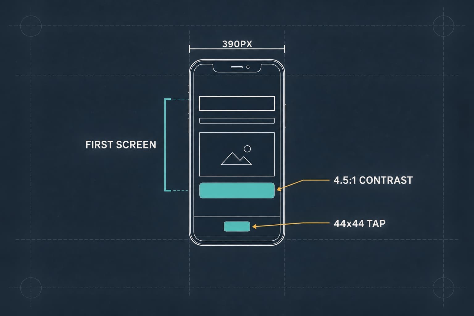
Start at 390px wide. A single column forces the decisions a two-column layout lets you dodge: what comes first, what comes second, and what gets cut. Squeezing a desktop layout onto a phone produces a page nobody designed.
What fits in the first mobile screen
A phone’s first screen holds roughly a headline, a supporting line, one image, and a button. That’s the budget. Navigation, logo walls, and a second CTA wait. Our section-order blueprints cover what goes where for each traffic type; the design question is whether each element in that screen earns its pixels.
The image-above-the-headline trap
When columns collapse, they stack in source order. A desktop layout with the headline left and the image right usually puts the image first on a phone.
Take a hypothetical B2B analytics company whose growth marketer, call him Marcus, approves a demo-request page on a 27-inch monitor. On a phone, the dashboard screenshot stacks above the headline, and the demo button lands about two thumb-scrolls down (an illustrative figure). A paid social visitor sees a chart too small to read and no offer. The fix costs nothing: headline and button first, then one cropped, legible chart.
Tap targets, thumb reach, and the sticky CTA bar
WCAG 2.2 sets a minimum target size of 24x24 CSS pixels, and its stricter AAA level asks for 44x44. Design primary buttons at the larger size. On long pages, a sticky bar at the bottom of the screen, where thumbs reach easily, keeps the button in reach. Don’t let a chat bubble cover it.
Customers notice when a landing page platform handles this. Libie Motchan, co-founder of Fulton, on the pages her team built in Pagedeck: “It was simple, it told a good story, it aligned with our brand, and it looked good on every single type of device.” Chris Livingston, co-founder of Gravel, said “everything from spacing to layout to how it looked across devices just worked.”
Above-the-fold landing page layout
The first screen does four jobs, and each one maps to a single element:
- What it is: the headline, continuing the ad’s promise
- Who it’s for: a qualifier line under the headline
- Why believe it: one proof element, like a rating, a logo, or a result
- What to do next: one button
Why each element converts is the high-converting guide’s job. This one is about arranging them.
The fold still matters, and scrolling isn’t dead
Both are true. NN/g’s eye-tracking research found users spent about 57% of their page-viewing time above the fold and 74% within the first two screenfuls. People scroll, but attention drops fast. Put the offer in screen one and the proof that settles doubt in screen two.
Hero image, video, or product shot
Choose by what the ad showed: the product in use for a demo ad, the creator for a talking-head ad, the product and price for a static offer. The hero confirms the click; it doesn’t introduce a new idea.
Visual hierarchy in landing page design
Hierarchy tells the eye what to read first. When it works, a three-second skim still delivers the offer.
One focal point per screen
Each screen needs one element that’s clearly loudest: the headline in screen one, then a price, a result, or the button further down. When two elements compete, the eye bounces between them and reads neither.
Size, weight, color, and space as ranking signals
The headline is largest. The button is the only element in the accent color. Supporting copy is lighter and smaller.
Whitespace promotes whatever it surrounds, so the button gets the most room in its screen. Good landing page UI is mostly this ranking done consistently.
F and Z patterns are symptoms, not layout goals
NN/g, which documented the F-pattern, says it shows up when a page has “text that has little or no formatting for the web” and calls it “bad for users and businesses.” Short blocks, clear subheads, and bolded key phrases stop it forming. One directional cue per screen, like a person in the hero looking toward the button, is plenty. A page full of arrows points nowhere.
Typography for landing pages
The desktop headline looked confident at 64px. On a phone it wraps to five lines and pushes the button off the first screen.
Headline size and body text on a phone
Size the mobile headline to fit in two or three lines at 390px, which usually means writing a shorter headline rather than shrinking the font. Keep body text at 16px or more. Below that, visitors pinch to zoom, and iOS Safari zooms the whole page when someone taps a form field set smaller than 16px. Check your embedded form’s styles too.
Font files are page weight
Each static font weight is a separate file, so two families in four weights is eight downloads before the text settles (a variable font packs the weights into one larger file). Use one family, two weights, and a fallback sized to match, so text doesn’t reflow when the web font arrives.
Imagery that sells
On a phone, the image is often the first thing visible. It has to show something specific.
Product in use, the outcome, or the person from the ad
Three kinds of image earn the spot: the product being used, the result the buyer wants, or the person from the ad. A home services company shows the finished job. A SaaS tool shows the one screen that delivers the promise. A skincare brand shows skin, not packaging.
Generic stock does the opposite. The handshake and the laptop on a cafe table say the page could be for anyone, which is the wrong message for a matched page.
Image weight: format, dimensions, lazy-loading
Serve WebP or AVIF, sized to the space the image fills. Set width and height so the layout doesn’t jump when images arrive. Lazy-load images below the first screen, but never the hero: it’s usually the largest element on the page and should load first.
CTA design and contrast
“Make the button stand out” is the landing page design advice everyone agrees with and nobody measures. WCAG gives you the numbers.
Contrast you can measure
WCAG 2.2 requires a contrast ratio of at least 4.5:1 for normal-size text, which covers most button labels, and 3:1 for large text. Non-text contrast sets 3:1 for the visual cues that identify a control, a sensible floor for the button against the page. Bright brand colors fail more often than you’d expect:
| Button | Label contrast | Button vs white page | Verdict |
|---|---|---|---|
| White on bright orange (#F97316) | 2.8:1 | 2.8:1 | Fails both |
| Near-black on bright orange | 5.2:1 | 2.8:1 | Label passes, shape is weak |
| White on burnt orange (#C2410C) | 5.2:1 | 5.2:1 | Passes both |
| White on deep teal (#0F766E) | 5.5:1 | 5.5:1 | Passes both |
Take a hypothetical dental clinic whose marketing manager, call her Priya, runs search ads to a booking page. The button is the clinic’s bright teal (#14B8A6) with white text: 2.5:1. On a phone in sunlight, it reads as a pale shape with faint words. She darkens it to #0F766E (5.5:1), and the button becomes the loudest thing on the page without leaving the brand’s color family.
Size, copy, and repetition
Make the primary button full-width on mobile. Write the label as the outcome: “Book my cleaning,” “Get the bundle,” “Start my trial.” Repeat the same button after each major section so a visitor convinced halfway down doesn’t scroll back up.
Style any secondary action, like “Watch the demo,” as a text link or outline button. Two buttons of equal weight split the decision.
Designing the offer module
Most design advice stops at the button, and the block where the visitor weighs price against value gets no design attention. The high-converting guide makes the case that the offer is the biggest lever on the page. Here’s how to lay it out.
Ecommerce: price, tier cards, and the guarantee line
Take a furniture brand selling a sofa in three sizes. The module needs:
- Three cards, with the middle one marked most popular
- The savings beside each price, in dollars and in percent
- One line under the button with the guarantee and shipping terms
- On a phone, the selected option’s price carried into the sticky bar
SaaS landing page design: plan cards and trial terms
SaaS landing page design runs the same logic. Show three plans at most, promote the recommended one visually, and put trial terms directly under the button instead of in fine print. On mobile, lead with the recommended plan, not the cheapest.
Services and lead gen: the block beside the form
For a quote, consultation, or booking offer, the module is the form plus what happens after it. Put a short “what happens next” list beside the embedded form: who calls, when, and for how long. The form comes from the tool you already use; the page frames it.
Speed-conscious landing page design choices
Every element you add is something a phone has to download and render, which makes page weight a design topic.
Every element has a load cost
| Element | What it adds | Cheaper alternative |
|---|---|---|
| Autoplay hero video | A large file and a player script | A still from the ad, with tap-to-play lower down |
| Image carousel | Several full-size images and a script | One strong image, or a static grid |
| Extra fonts and weights | A file each, plus reflow on swap | One family, two weights |
| Review and chat widgets | Third-party scripts and late-loading content | Reviews written into the page |
| Pop-ups | A script and an interruption over the offer | An inline offer section |
None of these are banned. Each should earn its cost the way a line item in a media plan does.
Layout shift and flicker are design defects
A review widget that loads late and shoves the button down is a visual bug. So is a client-side test that paints one headline and swaps in another, or an anti-flicker snippet that blanks the page until the swap finishes.
Pagedeck publishes fast, statically hosted pages: static files, images optimized on publish, edge delivery, and pixels that load without blocking render. Its A/B tests run server-side, so each visitor gets one complete version with no swap after paint.
Core Web Vitals as a design budget
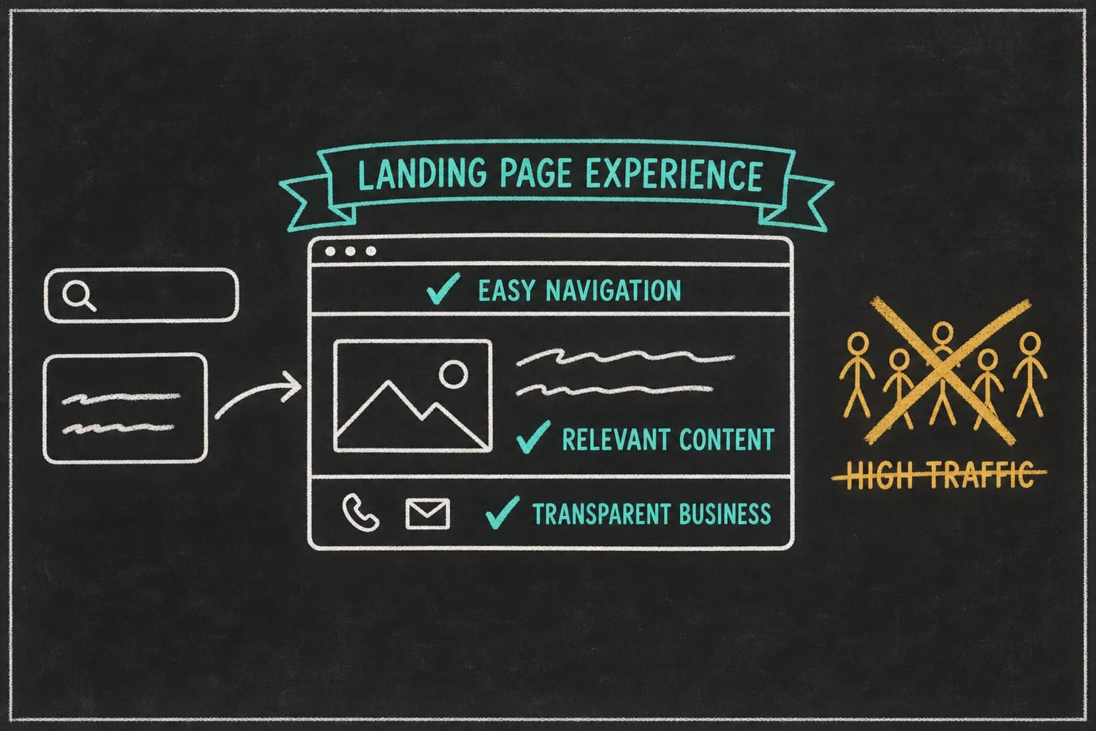
Google’s thresholds make a good design brief. Per web.dev, a good experience means Largest Contentful Paint within 2.5 seconds, Interaction to Next Paint of 200 milliseconds or less, and Cumulative Layout Shift of 0.1 or less, at the 75th percentile of page loads. Your hero image usually decides LCP; late widgets and unsized images cause most CLS. If you advertise on Google Ads, Google also rates the page after the click; our guide to landing page experience covers what that signal measures.
What the research says about speed and conversion
In Milliseconds Make Millions, Deloitte and 55, commissioned by Google, monitored 37 brand sites for 30 days at the end of 2019. A 0.1-second mobile speed improvement was associated with an 8.4% increase in retail conversion rates and a roughly 10% improvement in travel booking rates. It’s correlational and Google-funded, so read it as direction, not a forecast.
Visual message match: design the page to look like the ad
Message match usually means matching the words. The visual half gets skipped, though a visitor processes it first.
Same product shot, same palette, same face
Take a hypothetical supplement brand whose top-spending ad shows a creator, call her Jess, mixing a scoop into a glass in her kitchen. The page it sends traffic to opens on a bottle render against a blue gradient, and nothing there looks like what was clicked. The rebuilt page opens on a still from the same video, with the same kitchen, glass, and face, and the ad’s hook as the headline. In this illustration, the visitor recognizes the page instantly, with no new copy.
Connor Rolain, head of growth at HexClad, described the habit: “Once you find a format that works, you can easily duplicate it and swap out copy/media to make it congruent with your ad creative.”
When your ads look different, your pages should too
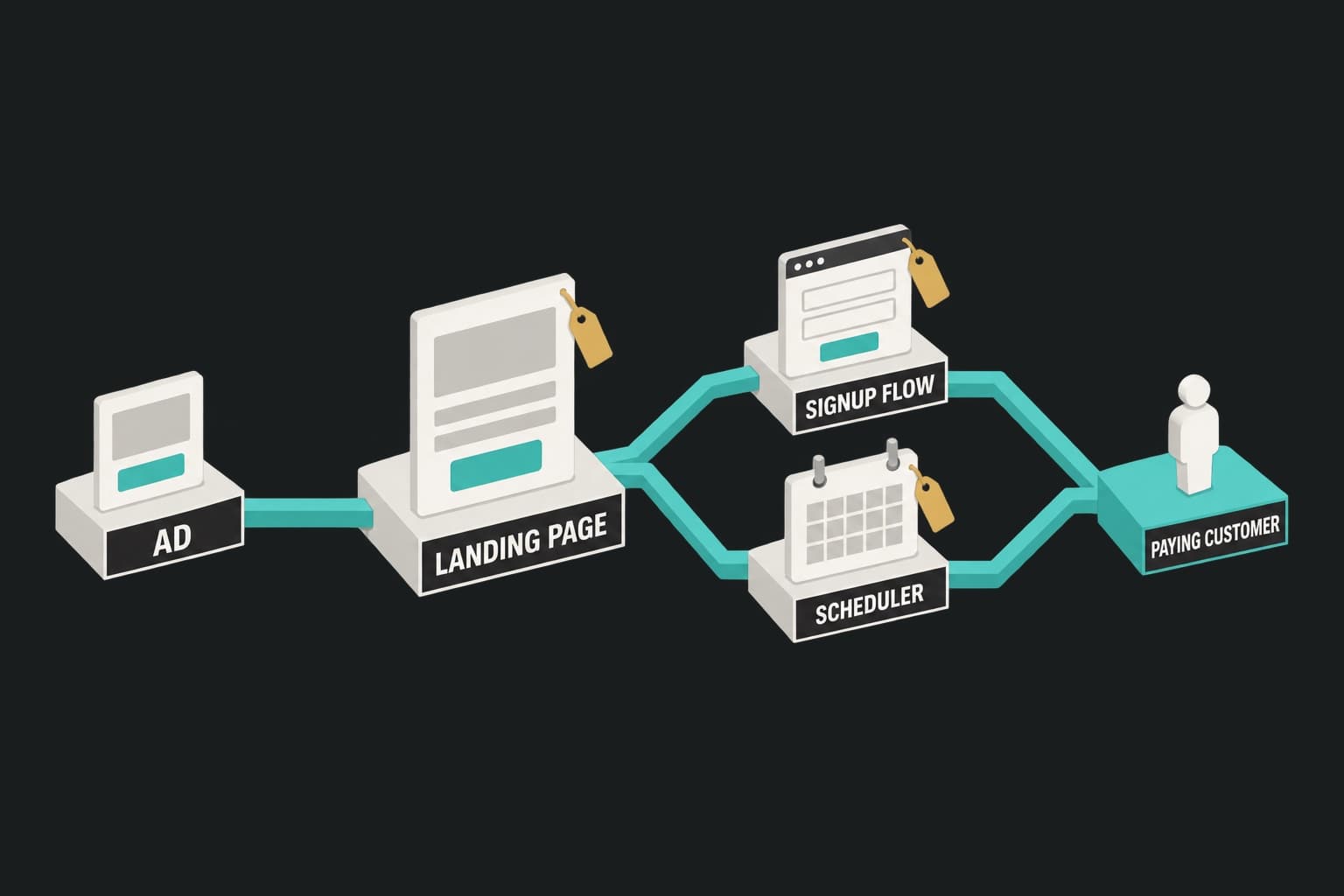
A UGC ad, a product demo, and a static offer set three different visual expectations, and one page can’t match all three. That’s the case for a landing page for every ad you run. Point Pagedeck at an ad and it picks up the offer, the angle, and the creative, then builds the matching page with your branding. Highlight any area and prompt the AI to change just that part; nothing else moves.
Testing design without fooling yourself
Landing page design tests go wrong when the layout and the copy both change: you’ll know which page won, but not why.
Test the layout and the message separately
Hold one constant while you test the other. Pagedeck’s AI variant generation writes copy along different angles with the layout identical, so the test measures the message. The guide to A/B testing landing pages covers setup and reading results; decide your sample size with a free calculator before you start.
Design tests worth running on low traffic
Skip button-color tests on low traffic; they need huge samples to detect small differences. Test big visual swings: the product shot versus the person from the ad, a sticky bar versus none, short page versus long. Use heatmap and session recording tools to find where phone visitors stall first.
Fulton increased paid conversion rate by 110% over 50+ page iterations. That’s the brand’s result from sustained iteration, not evidence for any single design choice.
Frequently asked questions
What is the best design for a landing page?
The one that makes the offer obvious to a phone visitor in the first screen: a headline that continues the ad, one matching image, one proof element, and a high-contrast button. The right layout depends on the ad and the offer.
What is the best way to design a landing page?
Start from the ad and the phone, not a desktop mockup. Design the 390px column first, fit the essentials into the first screen, then set hierarchy, type, and contrast against measurable standards before widening and testing.
- Start from the ad that will send the traffic.
- Lay out the single mobile column.
- Fit the offer, proof, and button into the first screen.
- Check CTA contrast (4.5:1) and tap size (44x44).
- Cut or replace heavy elements, then widen and test.
How do I design a landing page for mobile?
Landing page design for mobile starts with one column, a headline that fits in two or three lines, 16px body text, and full-width buttons at least 44x44 pixels. Add a sticky CTA bar on long pages, and check the stacking order so the headline never lands below the image.
What tool should I use to design a landing page?
Galleries work for reference and design tools like Figma or Canva for mockups, but building, publishing, and testing take a landing page platform. Pagedeck can recreate a mockup or any live page inside the platform, then publish it and run server-side A/B tests on it.
Conclusion
Landing page design is a sequence of decisions judged against two constraints: how fast a phone visitor understands the offer, and what each element costs to load. WCAG gives you contrast and tap-size numbers, Core Web Vitals give you a speed budget, and the ad tells you what the first screen should look like.
Start with the 390px column, give each screen one focal point, cut what the page can’t afford to load, and test one variable at a time.
Build your first page free, no credit card needed. Point Pagedeck at your ad and it builds the matching page with your branding, so your landing page design starts from the creative that earned the click.